For this project, the goal was to search for a product that has a design that could be updated. I had to do some research on the competitors of MOM'S Best Cereal to see what did they do in their designs, who their target audiences were, and what works or doesn't for them. My challenge was to design the packaging to target moms, but also still be unique and fit in their pricing range. With the packaging redesign, I also designed a branding booklet to help better showcase the redesign and research.
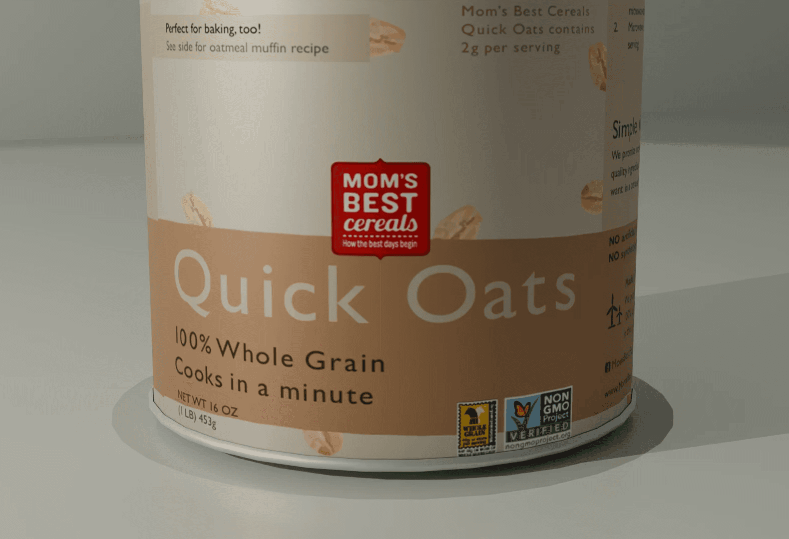


Here are a few close up images of the packaging. The imagery of the oats, blueberry, muffin, strawberry, pan, and custom microwave help add a bit of personality without it feeling overwhelming. It is also a way to connect to the original design as it has an illustration on the packaging. I also attempted a custom nutrition facts to not only work with the design, but also not feel like the focus of the packaging even though the information is needed. I also help adding some whitespace around the information so it doesn't feel cluttered or heavy.


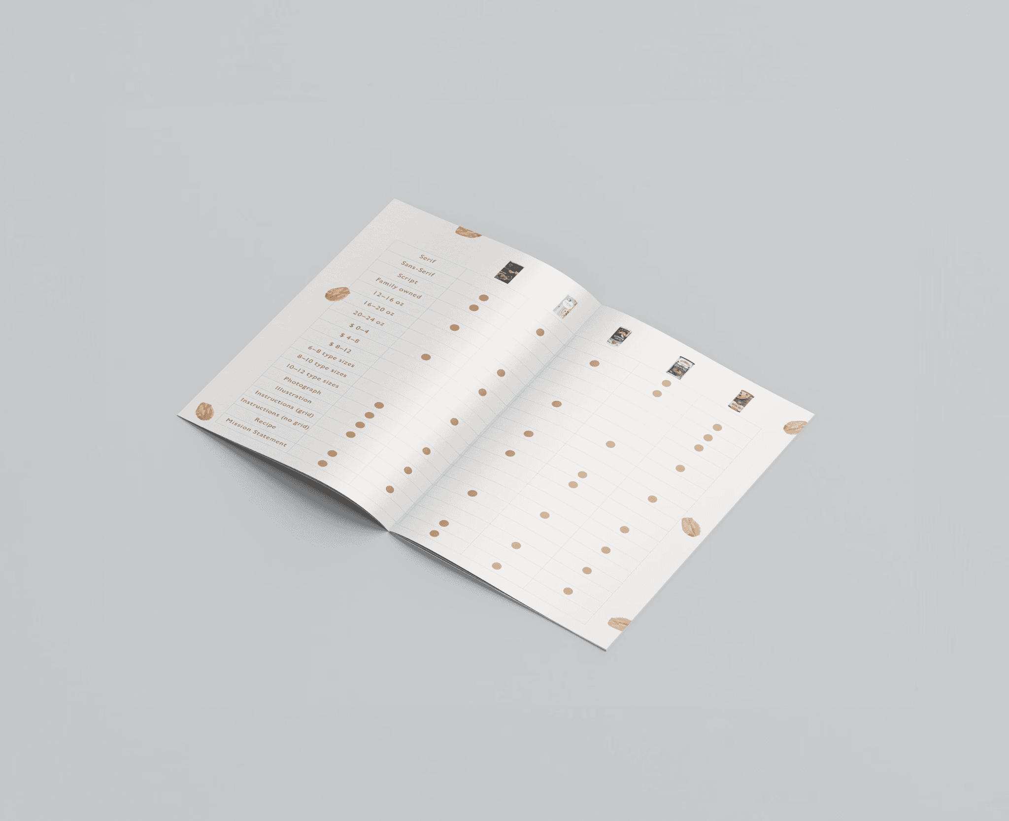
Booklet
For the redesign, I also had to design a booklet that shows the reasoning behind the new design. It shows the old design and explains what worked about the design and what could be improved upon. There are also spreads that showcase the competitors to the brand to see what they do that works and what doesn't. The following are images of some the the spreads in the booklet.